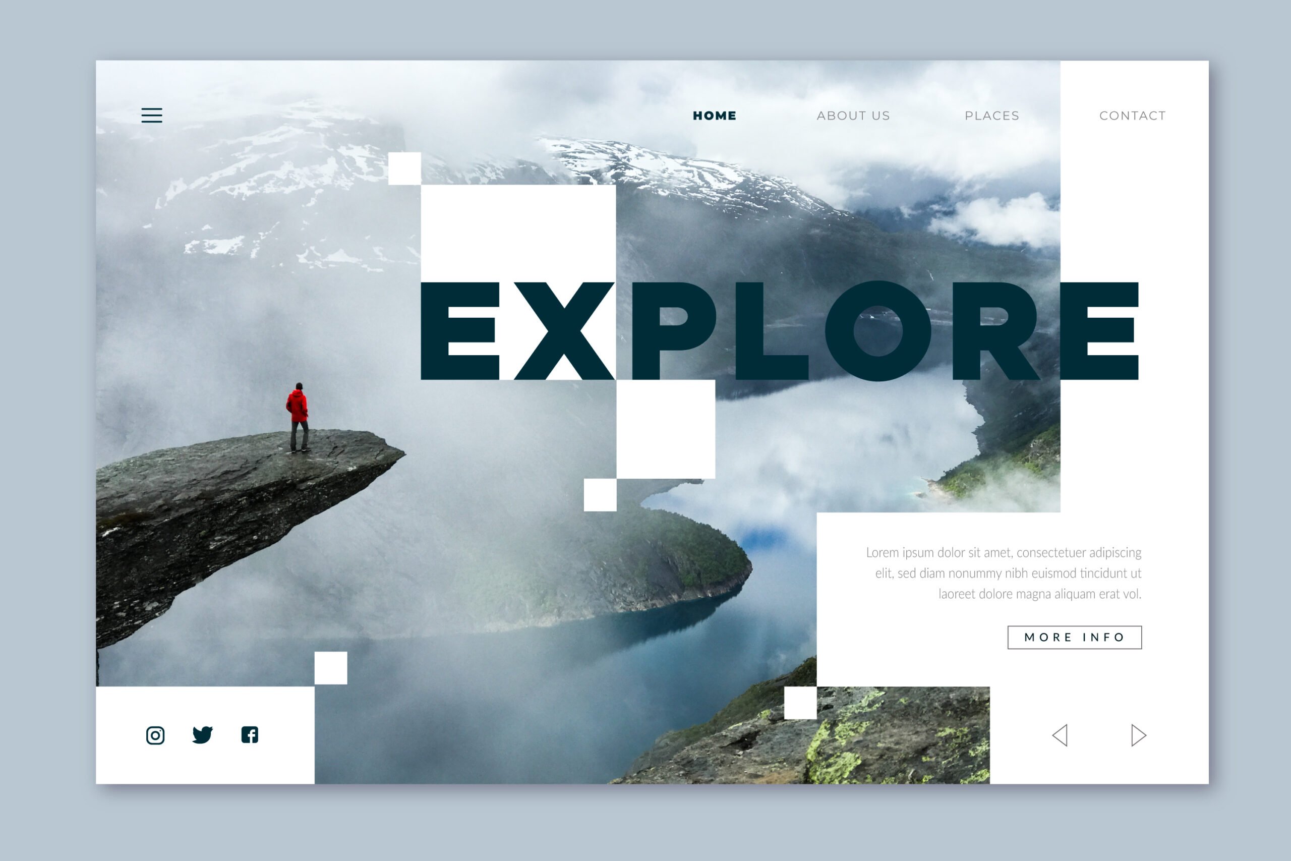
A landing page has a completely different job than a homepage, but we still see them built like one — a logo, a nav bar, three unrelated links, and a vague headline, all competing for the one thing the page actually needs: a single decision from the visitor.
A landing page exists for one action. Everything on it should either push toward that action or get out of the way.
Why Most Landing Pages Underperform
Traffic hits most landing pages already warmed up — from an ad, an email, a search query. They already have intent. What kills conversion isn’t a lack of interest, it’s a page that makes them re-decide whether they’re in the right place, then re-decide whether to trust you, then hunt for the button.
A great landing page has one goal, one path to it, and nothing on the page arguing against that path.
The Core Elements, in the Order They Should Appear
1. A Headline That Matches the Click
The single biggest conversion killer is a headline that doesn’t match what the visitor clicked to get here. If the ad said “50% Off Running Shoes,” the headline shouldn’t say “Welcome to Our Store.” Message match isn’t a nice-to-have — it’s the first trust signal on the page.
| Weak | Strong |
|---|---|
| “Welcome to [Company]” | “Get 50% Off Running Shoes — Today Only” |
| Vague, brand-first language | Specific, benefit-first language matching the ad/link |
| Clever wordplay | Clarity over cleverness, every time |
2. A Subheadline That Removes the Next Doubt
If the headline states the offer, the subheadline answers the question that immediately follows it — usually “how” or “for whom.” This is where you narrow the promise into something believable.
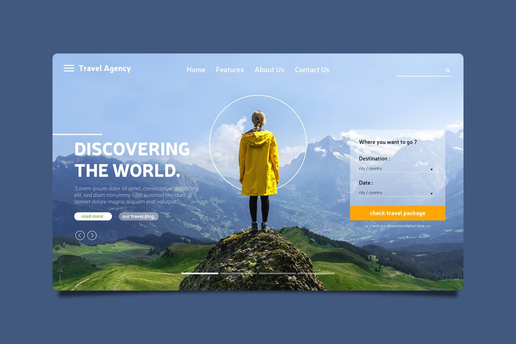
3. One Hero Image or Video — Showing the Outcome, Not the Product
The strongest landing page visuals don’t show a product in isolation, they show the result of using it: the shoe on a runner mid-stride, the software dashboard mid-use, the meal on the table instead of the ingredients in a box.
4. A Single, Unmissable Call-to-Action
There should be one primary action on the page, repeated, not five different ones competing. If the goal is “Sign up,” don’t also offer “Learn more,” “Contact us,” and “Download the brochure” with equal visual weight — every extra option is a chance to leave without converting.
- One CTA, restated at natural breakpoints (after the hero, after benefits, after proof)
- Button copy that names the action, not “Submit” — “Start Your Free Trial,” “Get My Quote”
- No competing navigation. Landing pages generally shouldn’t have a full site nav at all.
5. Benefit-Focused Copy, Not Feature Lists
Same principle as a product page: translate what the thing does into what changes for the visitor. Three tight benefit statements beat ten feature bullets nobody reads on a page they’re skimming for 8 seconds.
6. Proof, Placed Before the Ask Feels Risky
Testimonials, logos of known clients, review counts, case study numbers — proof needs to appear before the visitor has to commit, not after. If the CTA asks for payment or personal information, proof should sit directly above or beside it.
7. Objection Handling (FAQ or Short Guarantee Copy)
The last hesitation before converting is usually one specific worry: “What if it doesn’t work,” “Can I cancel,” “Is my data safe.” Address the two or three most common objections directly, near the final CTA — don’t make the visitor go searching for the answer.
8. A Final CTA With Nothing Below It
The last thing on the page should be the offer again, not a footer full of links to other parts of the site. A landing page footer, if it exists at all, should be minimal — legal links only, no navigation that gives the visitor a reason to leave.
Where Landing Pages Usually Break Down
- Reusing the homepage template, nav bar and all, which gives visitors an easy exit ramp before they convert.
- Message mismatch with the ad or email that drove the click — see the headline section above; this alone can tank conversion rates.
- Forms asking for more than the offer justifies — a free guide download doesn’t need a phone number and a company size dropdown.
- Slow load time undoing paid traffic — if you’re paying per click, a slow landing page is burning ad spend; see our piece on getting your site under 3 seconds.
- No mobile testing, when most ad traffic — especially social — arrives on mobile first.
Landing Page vs. Product Page: Not the Same Job
Worth separating clearly, since the two are often confused:
| Landing Page | Product Page | |
|---|---|---|
| Goal | One specific conversion | Purchase, but browsing is expected |
| Navigation | Minimal or none | Full site nav |
| Traffic source | Ads, email, campaigns | Search, browsing, catalog |
| Content depth | Focused, short | Deep — specs, reviews, FAQs |
If you’re running paid traffic to a product page instead of a dedicated landing page, that mismatch alone is often the biggest lever available.
The Bottom Line
A landing page isn’t a smaller homepage — it’s a single argument, structured to end in one action. Match the message that brought them there, prove you’re trustworthy before the ask feels risky, and remove every path off the page that isn’t the conversion. The pages that convert best are usually the ones that look “too simple” to the person who built them.

Builds and hosts WordPress sites for small businesses. Writes about the practical side of running a website — cost, speed, and what's actually worth paying for.