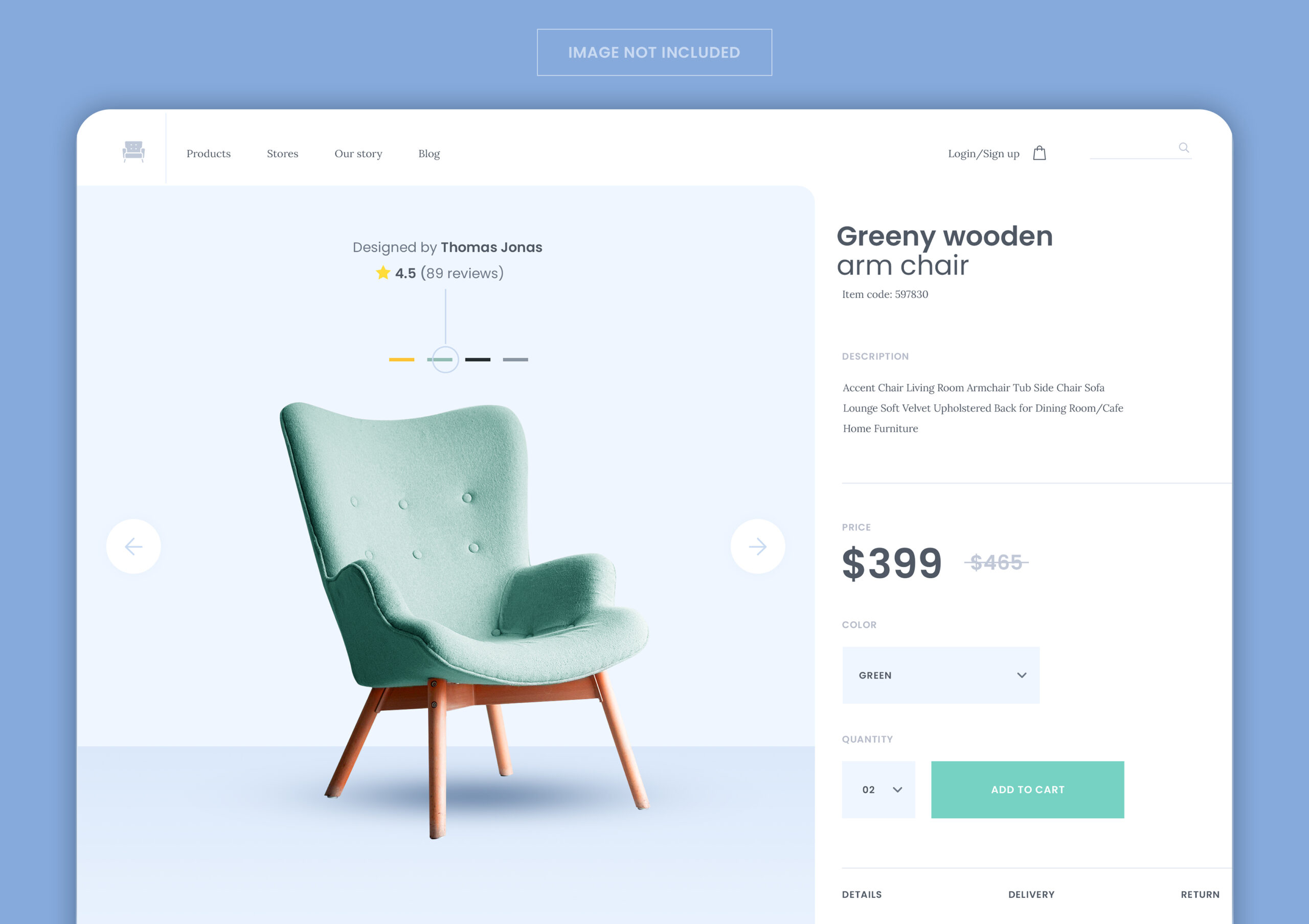
We’ve rebuilt product pages for enough stores to notice a pattern: the ones that convert well almost never win on flashy design. They win because every element on the page is doing a specific job, in the right order, with nothing missing and nothing competing for attention.
This isn’t a checklist of “best practices” copied from a marketing blog. It’s what we actually look for when a client asks why their product pages get traffic but not sales.
Why Most Product Pages Underperform
A product page has one job: answer every question a buyer has, in the order they’d ask it, before they have to go looking elsewhere. Most pages fail at this not because they’re missing information, but because the information is in the wrong place, buried below the fold, or split across tabs nobody clicks.
A great product page removes doubt faster than a visitor can develop it. Every section either answers a question or moves them closer to buying — if it does neither, it shouldn’t be there.
The Core Elements, in the Order They Should Appear
1. The Hero Image (or Gallery)
This is the first thing a visitor judges the product on, before reading a single word. It needs to show the product clearly, at a size that doesn’t require zooming, ideally from multiple angles and in actual use — not just on a white background.
| Weak | Strong |
|---|---|
| One low-res product shot | Multiple angles, zoom, lifestyle context |
| White background only | At least one in-use or scale shot |
| Stock-style staging | Photos that match how it’ll actually arrive |
2. Title and Price — Immediately Visible
No scrolling, no guessing. The product name and price should be visible without any interaction. If there’s a discount, show the original price struck through — the comparison itself builds urgency.
3. A One-Line Value Statement
Before any bullet points or specs, one sentence answering “why this, why now.” This is copywriting, not a spec sheet — it’s the difference between “Wireless Earbuds” and “Wireless Earbuds Built for All-Day Calls.”
4. Benefit-Led Bullet Points (Not Just Specs)
Specs tell a buyer what a product has. Benefits tell them what it does for them. The strongest product pages translate every spec into an outcome:
- Not “600mAh battery” → “12 hours of playback on a single charge”
- Not “Aluminum housing” → “Built to survive a drop without a case”
- Not “IP67 rated” → “Rain, sweat, or a spilled coffee — it doesn’t care”
5. Social Proof, Placed Where Doubt Peaks
Reviews and ratings work best right where hesitation naturally shows up — near the price and the add-to-cart button, not buried in a tab at the bottom of the page. A visible star rating with a review count does more work than a five-paragraph testimonial nobody reads.
6. The Add-to-Cart Area
This is the highest-stakes real estate on the page. It needs:
- A button that’s visually the loudest element on the page
- Clear stock status (“In Stock,” “Only 3 left,” “Ships in 2 days”)
- Variant selectors (size, color) that are easy to tap, not a cramped dropdown
- Shipping and return info visible nearby, not hidden behind a link
7. Detailed Description and Specs (Below the Fold)
Once the visitor has enough to decide, the deeper content — full specs, materials, sizing charts, care instructions — earns its place. This is for the buyer who wants to be thorough, not the one deciding whether to keep reading.
8. FAQs That Preempt Support Tickets
If you’re answering the same question in customer support emails every week, it belongs on the product page. This single change quietly reduces both cart abandonment and support volume.
9. Related or Complementary Products
Shown after the core buying decision is made, not competing with it. “Frequently bought together” and “you might also like” belong near the bottom, not next to the add-to-cart button where they’d distract from the primary decision.
Where Product Pages Usually Break Down
- Slow-loading image galleries that undo everything good about the photography — see our piece on getting your site under 3 seconds if this sounds familiar.
- Mobile layouts that were never actually tested, where the add-to-cart button ends up below three scrolls of specs.
- Reviews systems that are technically present but visually invisible — a “4.8 (212)” in tiny gray text does almost nothing.
- Generic, unedited manufacturer descriptions pasted in as-is, with no attempt to translate specs into benefits for the actual audience.
The Bottom Line
A great product page isn’t decorated — it’s sequenced. Every element has a job: show the product, name the benefit, prove it’s trusted, remove the friction to buy, then answer whatever’s left. Get the order right and the design work becomes secondary. Get the order wrong, and no amount of polish fixes a page that’s answering questions in the wrong sequence.

Builds and hosts WordPress sites for small businesses. Writes about the practical side of running a website — cost, speed, and what's actually worth paying for.